Wireframe, clickable prototype or coded prototype
Prototype fidelity should match the question you are trying to answer. A guide to choosing the cheapest artifact that will actually settle the decision.

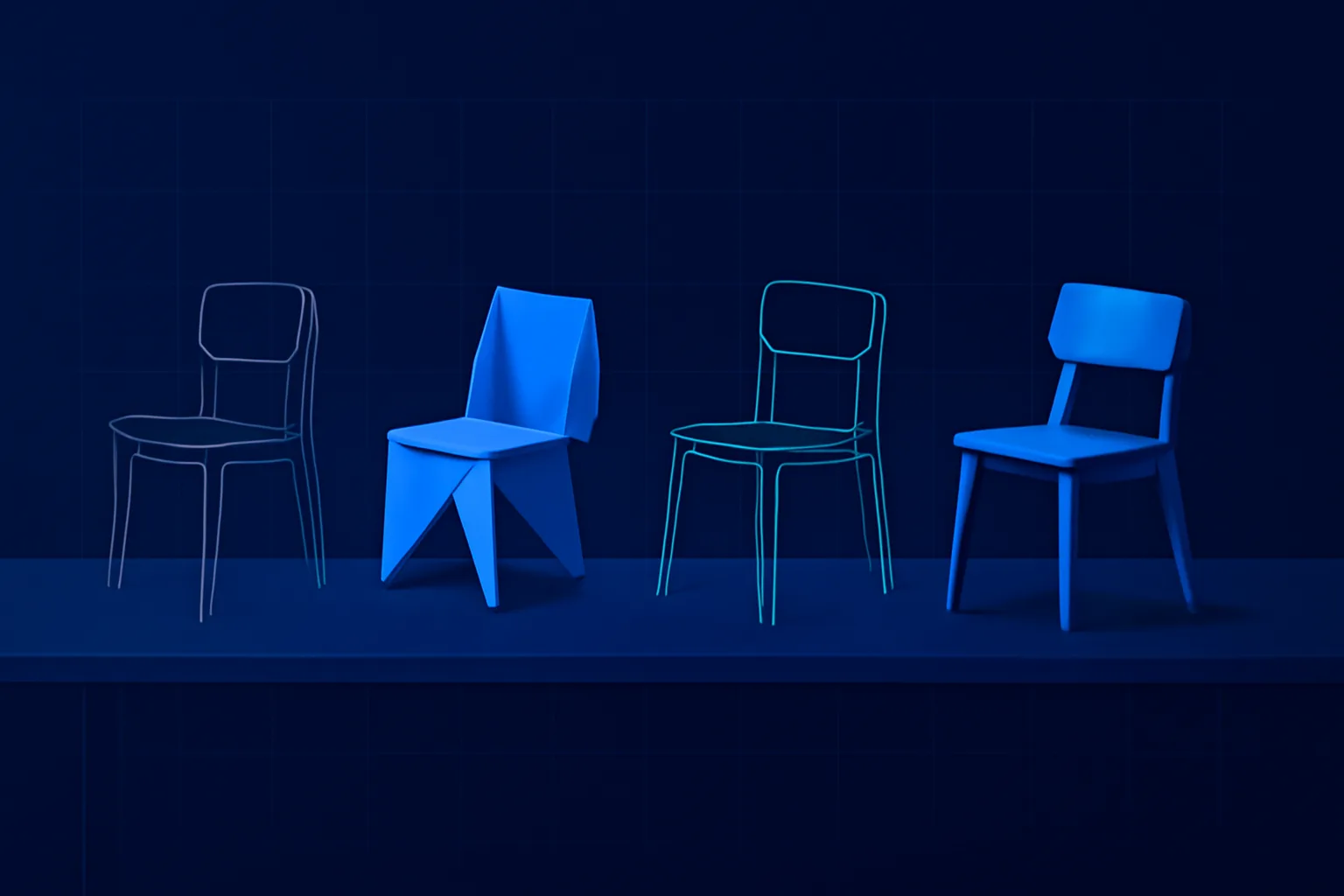
Teams often argue about whether to wireframe, go straight to high-fidelity design or build a prototype in code. The argument is usually framed as a matter of taste or process, but it has a practical answer. Every design artifact exists to answer a question or reduce a risk. The right fidelity is the cheapest one that can answer the question in front of you. Build more than you need and you waste time polishing things that will change. Build less and you make decisions on evidence that cannot support them.
Name the question first
Before choosing a format, write down what you need to learn or decide. The question determines the fidelity far more than the stage of the project does.
- Do we have the right content and structure? Sketches or low-fidelity wireframes are enough.
- Can people find their way through this flow? A clickable prototype, even in grayscale, is needed.
- Does this feel trustworthy and on brand? Visual design at high fidelity is required.
- Does this interaction feel right with real data and real speed? A coded prototype is usually the only honest answer.
On a single project you will likely use several of these, at different times, for different parts of the product. A checkout flow might need a coded prototype to test address autocomplete, while the account settings pages never go beyond wireframes before being built.
Low fidelity: sketches and wireframes
Sketches and wireframes are for structure, content and priorities. They are fast to make, fast to change and, importantly, look unfinished, which invites honest feedback. Stakeholders comment on what the page does rather than the shade of blue.
Wireframes work best when they use real or realistic content rather than placeholder text. Many layout problems only appear when the real product names, prices and descriptions are dropped in. A product listing that looks tidy with "Lorem ipsum" breaks when a title runs to three lines.
The limitation is that wireframes cannot tell you how an interface feels to use. People are poor at predicting their own behavior from static screens, so wireframes should not be the basis for claims about usability.
The right fidelity is the cheapest artifact that can answer the question in front of you. Anything more is polish on something that will change.
Mid fidelity: clickable prototypes
Linking screens into a clickable prototype lets you test flows with real users before development. This is where most usability problems in navigation, labeling and sequence are found, and it is dramatically cheaper to fix them here than after launch.
Keep clickable prototypes focused. Prototype the paths you want to test, not every possible state. A prototype for a booking flow might cover the three most common journeys and a couple of error cases, with other links disabled. Trying to make a prototype fully functional in a design tool produces a fragile, hard-to-maintain file that nobody wants to update.
Visual fidelity can stay moderate at this stage. Grayscale with realistic typography is usually enough for users to behave naturally. Add brand color and imagery only when visual perception is part of the question, such as whether a call to action stands out.
High fidelity: visual design and coded prototypes
Visual design
High-fidelity mockups answer questions about perception: hierarchy, brand, trust and emotional tone. They are also the reference developers build from. Create them once structure and flow are settled, or you will redraw polished screens repeatedly as fundamentals change. With a mature design system, high-fidelity screens can be assembled quickly from existing components, which shortens this phase considerably.
Coded prototypes
Some questions cannot be answered in a design tool. Search-as-you-type behavior, drag and drop, data-heavy tables, animations tied to scrolling and anything that depends on real performance all behave differently in a browser. For these, a small coded prototype, built quickly and intended to be thrown away, is the most honest test. It is also the best way to settle debates between designers and engineers about what is feasible.
The risk with coded prototypes is that they become production code by accident. Be explicit that a prototype is disposable, keep it in a separate repository and budget for building the real thing properly.
Match fidelity to risk and audience
Two further factors should influence the choice.
- Risk of being wrong. A high-traffic checkout or an onboarding flow for a new product deserves more validation, and so higher fidelity testing, than a rarely used admin screen.
- Audience for the artifact. Executives and clients who are not used to design artifacts often struggle with wireframes and respond better to realistic screens. Developers may need interaction details that only a prototype conveys. Tailor what you show, even if the underlying thinking is the same.
A useful rule of thumb from our projects: spend roughly a third of design time on structure and flow at low and mid fidelity, and test before moving on. Teams that skip straight to high fidelity usually spend that time anyway, just later and on rework.
It also helps to be explicit with stakeholders about which fidelity you are presenting and why. A short note at the top of a review, such as "this is a structure review, ignore visual styling", prevents a meeting from being spent on colors when the goal was to agree on content priorities. Setting that expectation is part of the craft, not an administrative extra.
Our wireframing and prototyping work is organized around this principle, with each artifact tied to a specific decision. Clickable prototypes feed directly into usability testing, and once flows are validated, our web UI design team takes them to high fidelity using the project's design system.
Plan your next design phase
If your team is stuck between endless wireframe reviews and expensive rework, we can help set up a leaner design process. Talk to us about your project and receive a fixed-price quote within 24 hours.